Frequency Distribution in Statistics

Imagine if you have raw data to analyze; will it be easy to draw insights from it? Of course, not. Especially if you have to make conclusions from a dataset containing millions and billions of data.
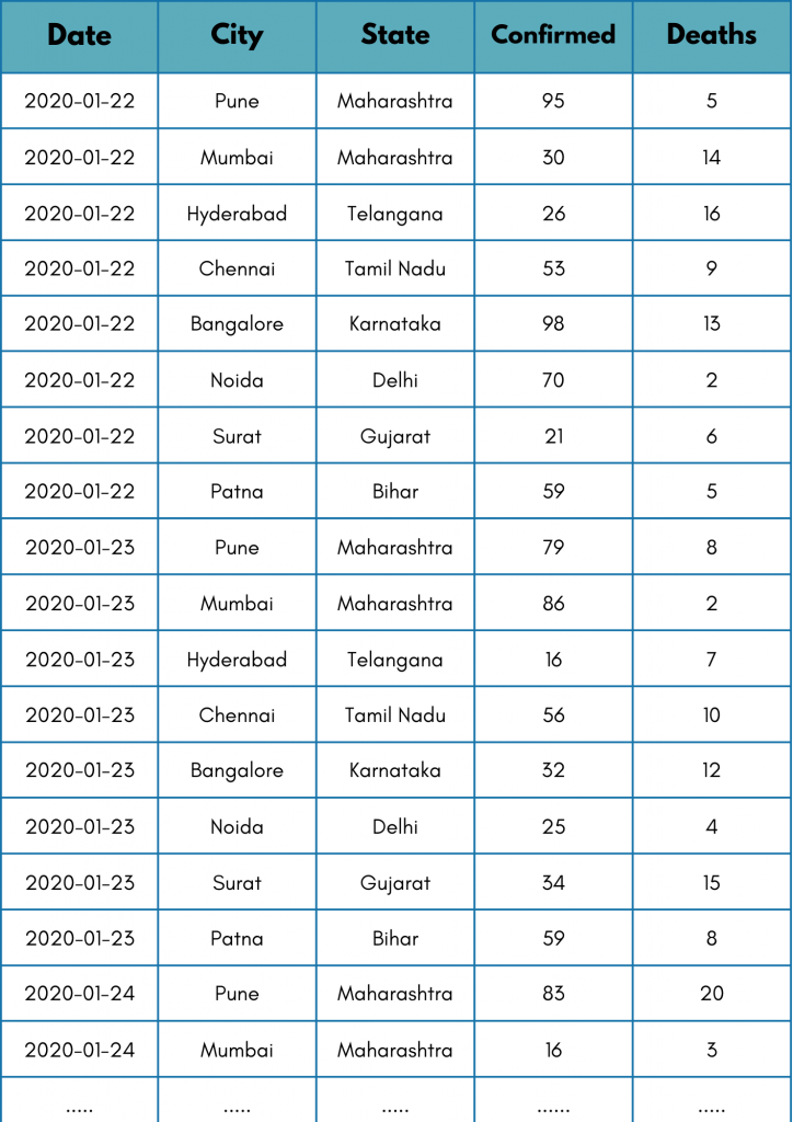
To understand it more simply, we have taken some raw COVID-19 data. Let’s see if you can tell me in 5 seconds, How many deaths occurred in Maharashtra? Just by looking at the dataset given below!
Time is over! I know you struggled to get the answer. Now, try to answer the same question again. This time, take a look at the table given below.
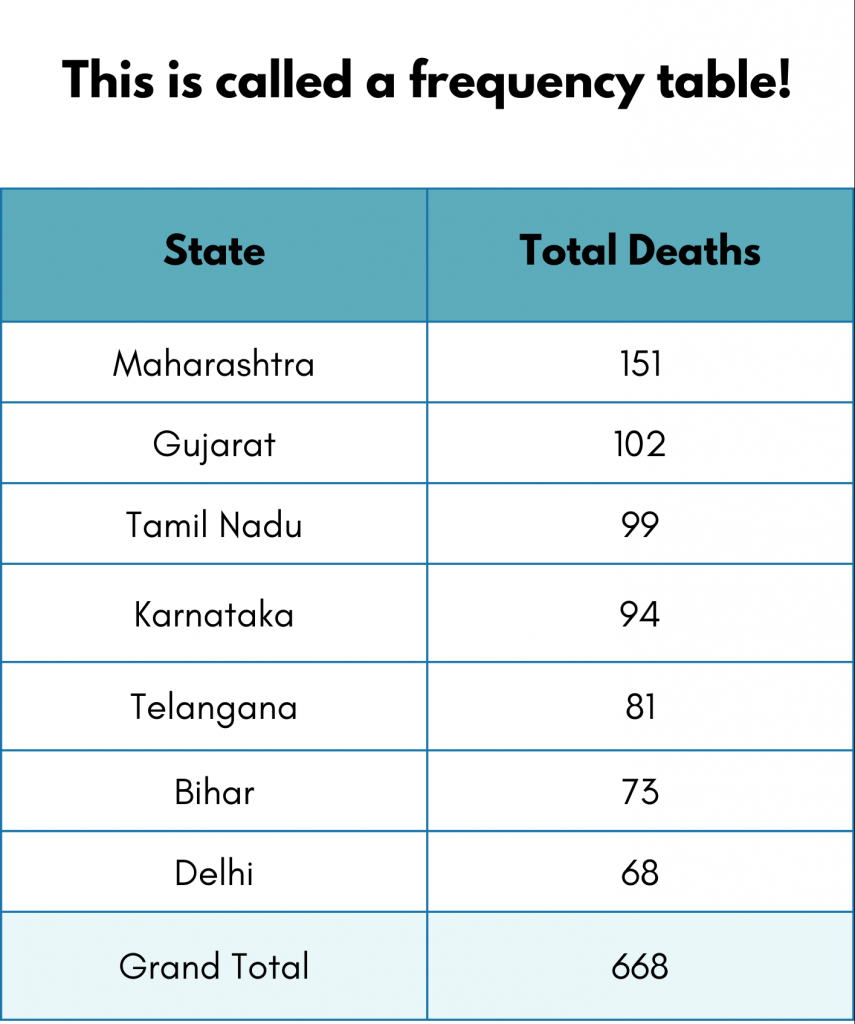
It was easy this time, right? You must have answered it in 2 seconds. It is organized, summarized, and easy to interpret.
“In a frequency table, frequency refers to the number of times something has happened.”
In statistics, frequency distribution refers to the visual representation of an event’s occurrence frequency. This visual representation could be in two ways:
- Graphical or
- Tabular
In other words, frequency distribution shows the number of observations in a given interval (we will see what data intervals are later in the blog).
Why Choose Frequency Distributions over Regular Raw Data?
Let’s look at the advantages of using frequency distributions:
- They present the raw data in an organized, easy-to-read format.
- They can be visualized through graphs or tables, which are easier to understand.
- They make the descriptive analysis easy.
Types of Frequency Distribution
There are four different frequency distributions in the statistics that you must know. We will understand each of them with the help of a real-life example.
Being a Data Analyst and out of lockdown boredom, you can’t keep calm. Hence you decided to analyze what’s happening with COVID-19 cases and deaths. As the data is raw and probably huge, we need to use Frequency distribution techniques to make it easy for our analysis.
Ungrouped Frequency Distribution
There is a constant surge in no. of reported confirmed cases and, unfortunately, no. of deaths. We have records of the number of cases for each city for each day. Hence we need to check the day-wise COVID-19 confirmed cases to get aggregated statistics. Can you tell me how many cases were in total for each day just by looking at the raw data?
Did you lose count? Now, take a look at the following summarized data. It shows the day-wise distribution of confirmed COVID-19 cases.
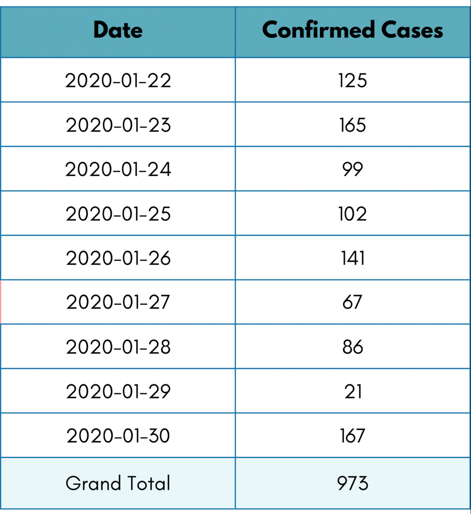
Looking at the pivot table, you can tell there were 125 confirmed COVID-19 cases on 22nd January, and so on.
We aggregated the raw data into a table. We summed up the results. This is also known as regrouping.
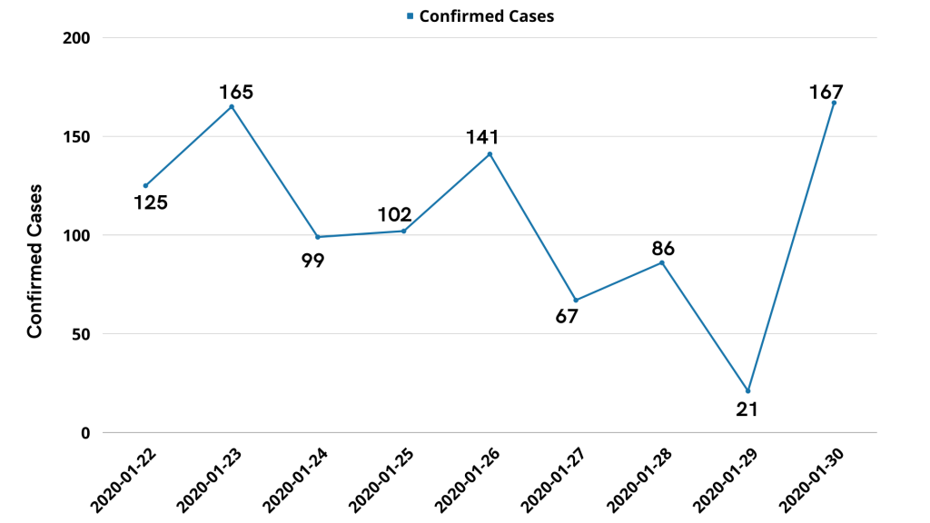
Even though we got summarized data, comparing cases on different days can still be a little challenging (visually), and it will be difficult to visualize the trend. To solve those problems, we can easily visualize this data with the help of a simple line chart. We use a line chart since it is the most commonly used chart to showcase a trend over time.
Also, curious to find out the total number of confirmed COVID-19 cases in different cities. Let’s see the pivot table for the data.
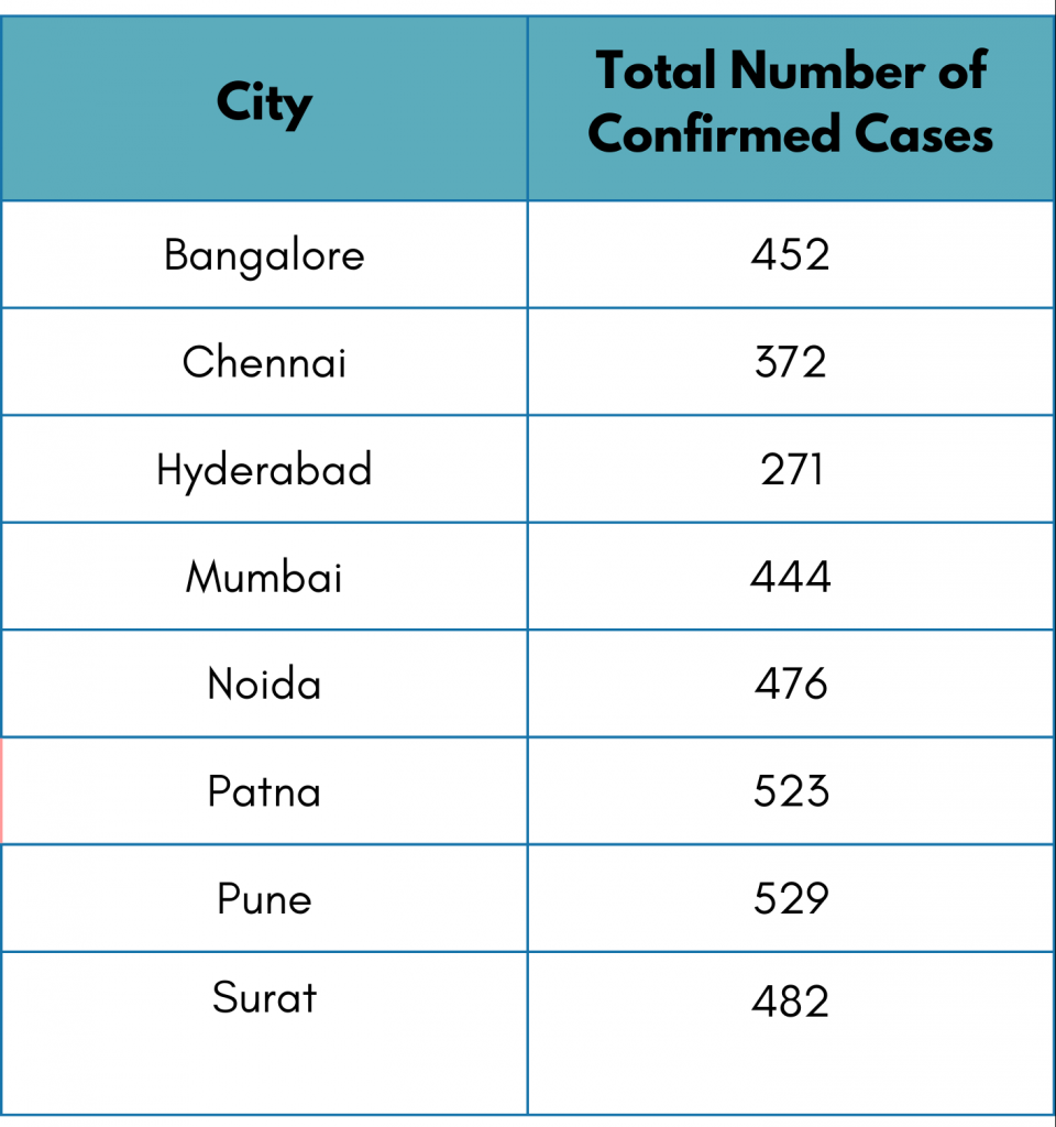
Considering the similar struggle, tabular reports are sometimes hard to follow because of too many data points. This time we will visualize the report with the help of a bar graph. We primarily use a bar graph in case of ungrouped and categorical data. Here the categories are the cities.
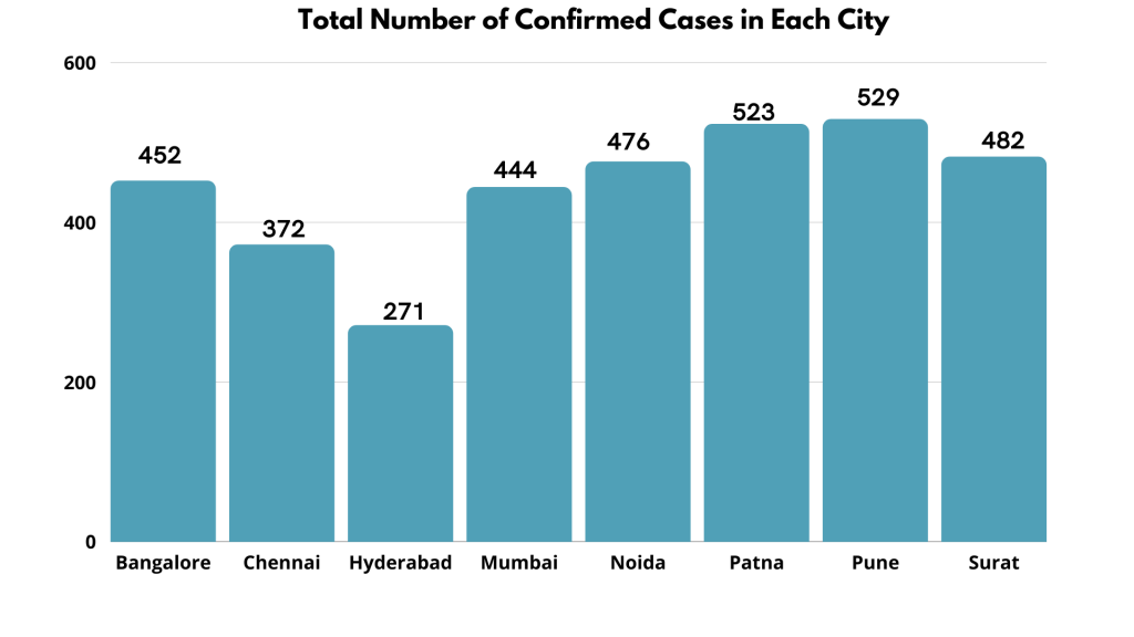
This is how easy it is to visualize ungrouped data through frequency distributions.
An ungrouped frequency distribution shows the number of times each data value appears in the respective group.
Note: Ungrouped frequency distributions are best suited for small datasets containing a few unique data values.
Grouped Frequency Distribution:
We have all seen those scary days. The situation was horrible. Everyone, from kids to old people, was affected by the virus. But were they affected equally? Or was it just the old people above 60?
Let’s see which age group was the most prone to COVID-19. Since the data is enormous and the age values are repetitive, we can group the age column into the following categories.
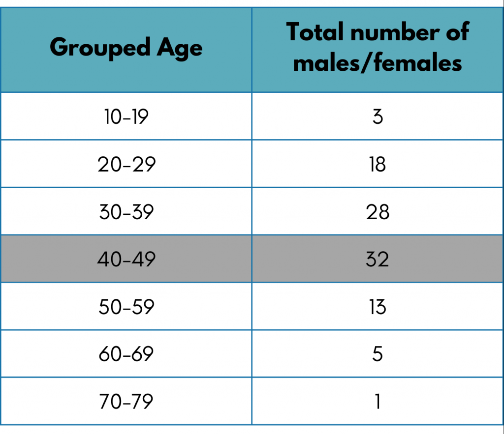
The above table shows that the maximum number of deaths occurred in the ages 40-49. This was surprising, wasn’t it?
Let’s visualize it through a bar graph. A bar graph and histogram are the best choices for the chart to visualize grouped frequency distributions.
As we know from the previous discussion, the best chart to plot categorical distribution is a Bar chart.
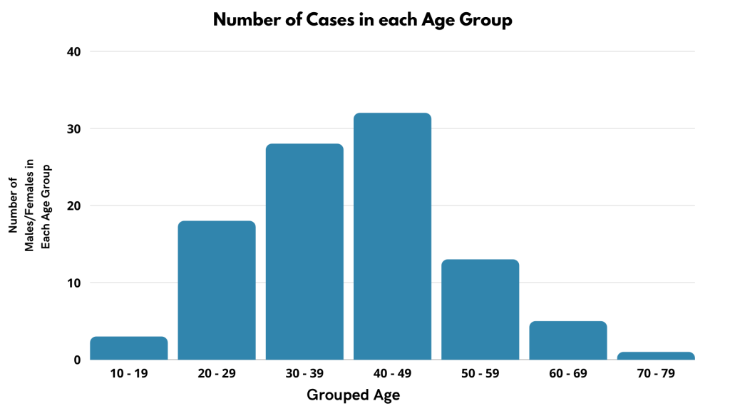
On the other hand, the same data can be visualized using a univariate plot, i.e., Histogram. Here groups are formed with default bin size.
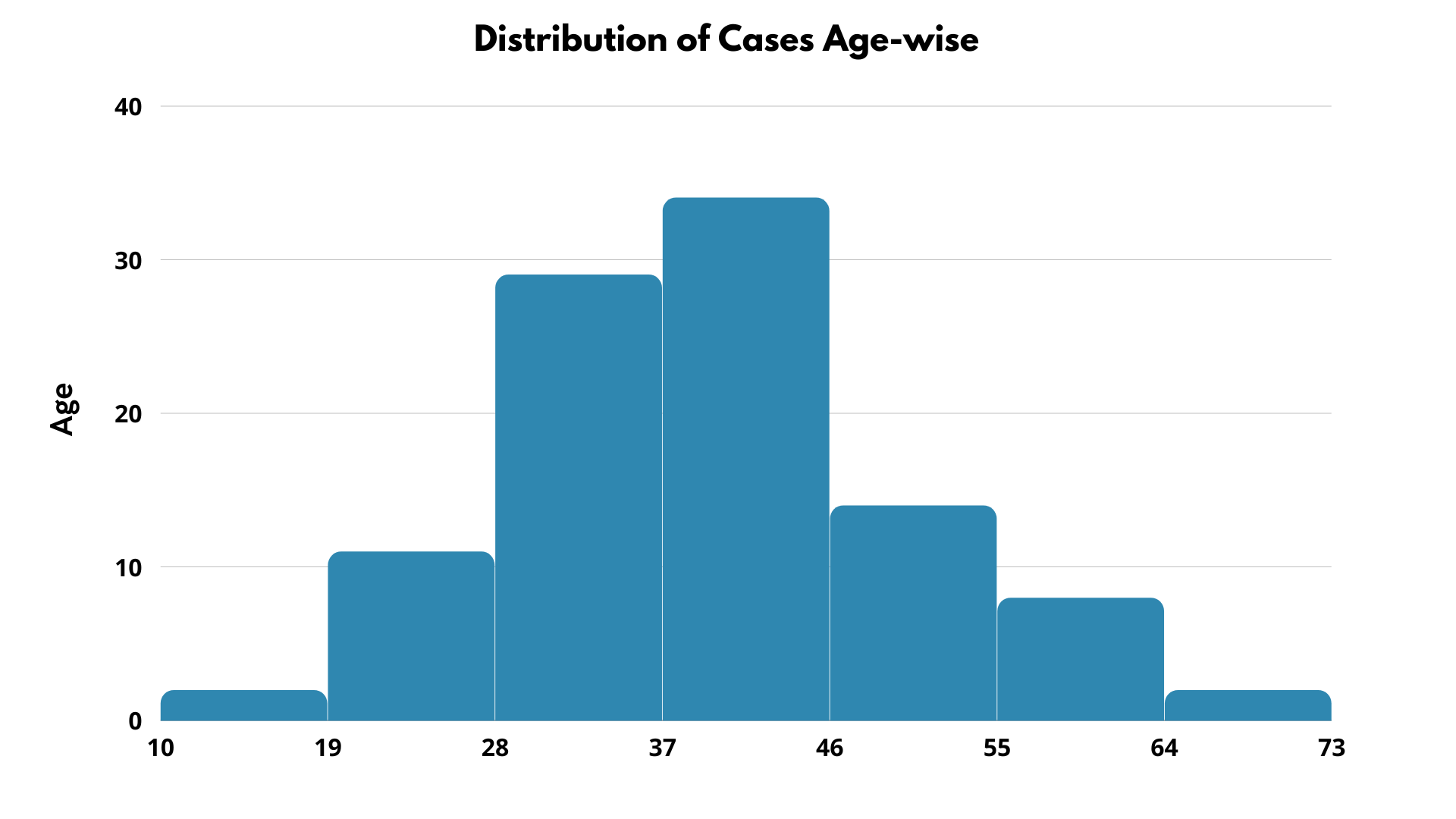
A grouped frequency distribution shows the frequency of the data by grouping the data sets into different intervals/groups. In the current example, everyone ages 10 to 19 is grouped in the 10-19 group.
Note: Grouped frequency distribution is mainly used when data records are enormous, values are repetitive, and summarizing the data doesn’t make sense alone. Therefore, we group the data points into limited categories (so we can visualize them easily), classifying them into intervals. For instance, if the column is a continuous (quantitive) column, we group the data in a range or interval, e.g., age. If the data is categorical (qualitative), we group them into a higher category. In our given data, we can group cities Mumbai and Pune under the parent category, i.e., Maharashtra.
Relative Frequency Distribution:
As a Data Analyst, you love relating data points to each other and drawing comparisons, don’t you?
Every state suffered a large number of deaths, and to find out which state contributes how much % of deaths compared to all other states, we will have to check relative frequency.
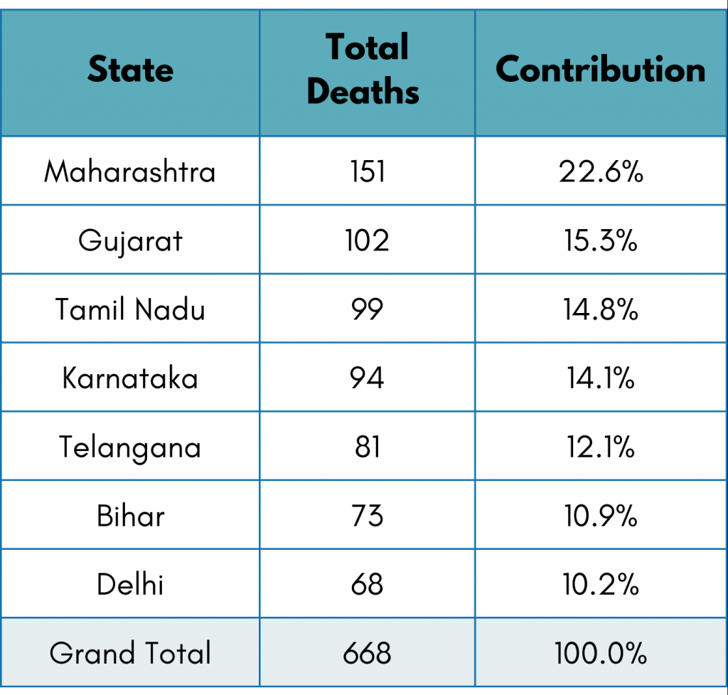
From the above table, we can see that Maharashtra contributed 22.6% to the total deaths, whereas Delhi contributed only 10.2% to the total deaths.
We can easily use a Bar chart to plot the distribution, but if we want to check the contribution, a pie chart is the best choice. A pie chart will give us a clear picture of the percentage of deaths that occurred in each state.
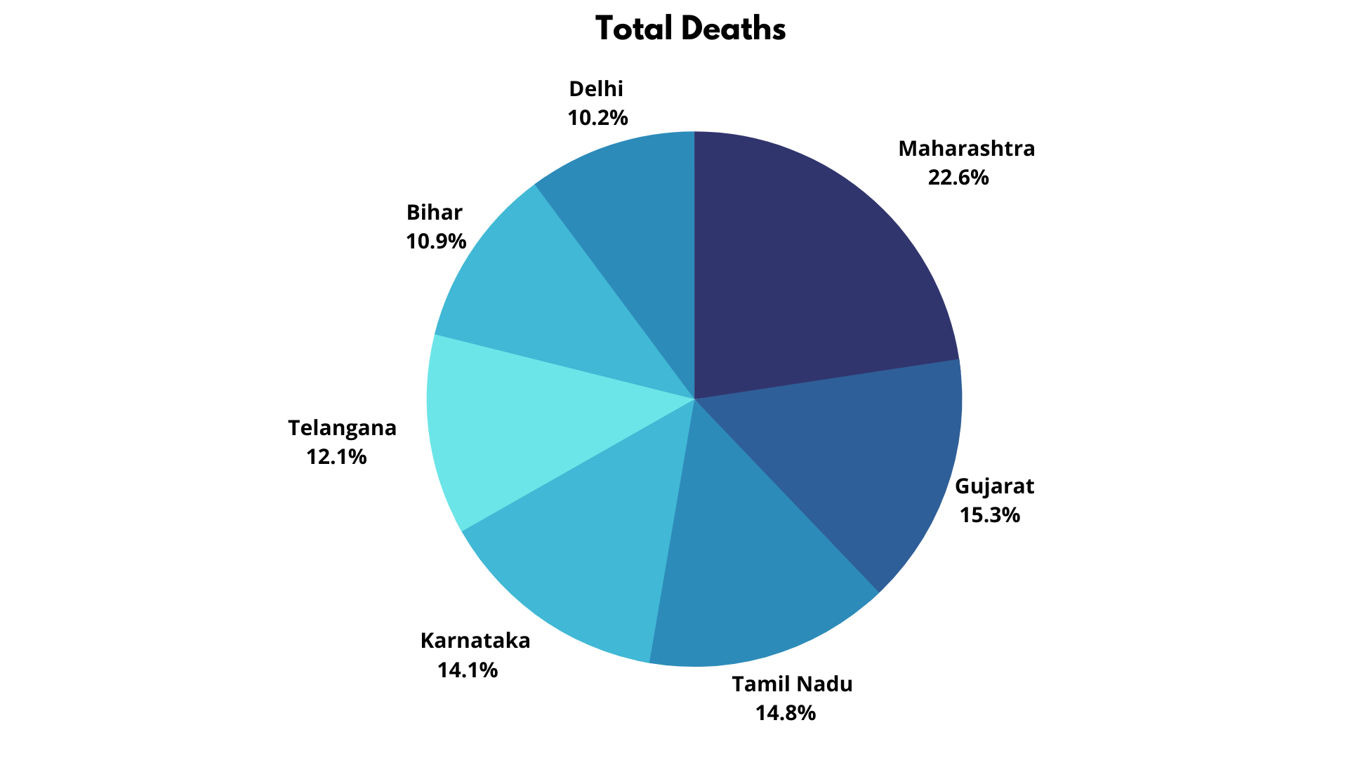
It shows that Maharashtra has been the most significant contributor to deaths, followed by Gujarat. It helps the central government allocate vaccines and funds to those cities.
Relative frequency distributions show us the proportion of each data value in the given data. They help us know about the percentage distribution of data.
Note: Relative frequency distributions are best suited to compare and find percentage contributions.
Cumulative Frequency Distribution:
Because of COVID-19, we all have seen unfortunate and unpredicted losses. Although keeping track of no. of the reported confirmed cases helps the government to take preventive actions. It helps recovery from Covid and can be false positive sometimes, but deaths due to CoVid are irreversible. Hence tracking cumulative deaths can be an important KPI for the government.
To find the total deaths till now (as per the last date in the data), we need to find cumulative deaths day-wise. To find out, we will need to know the deaths. Let’s take a look at the table first.
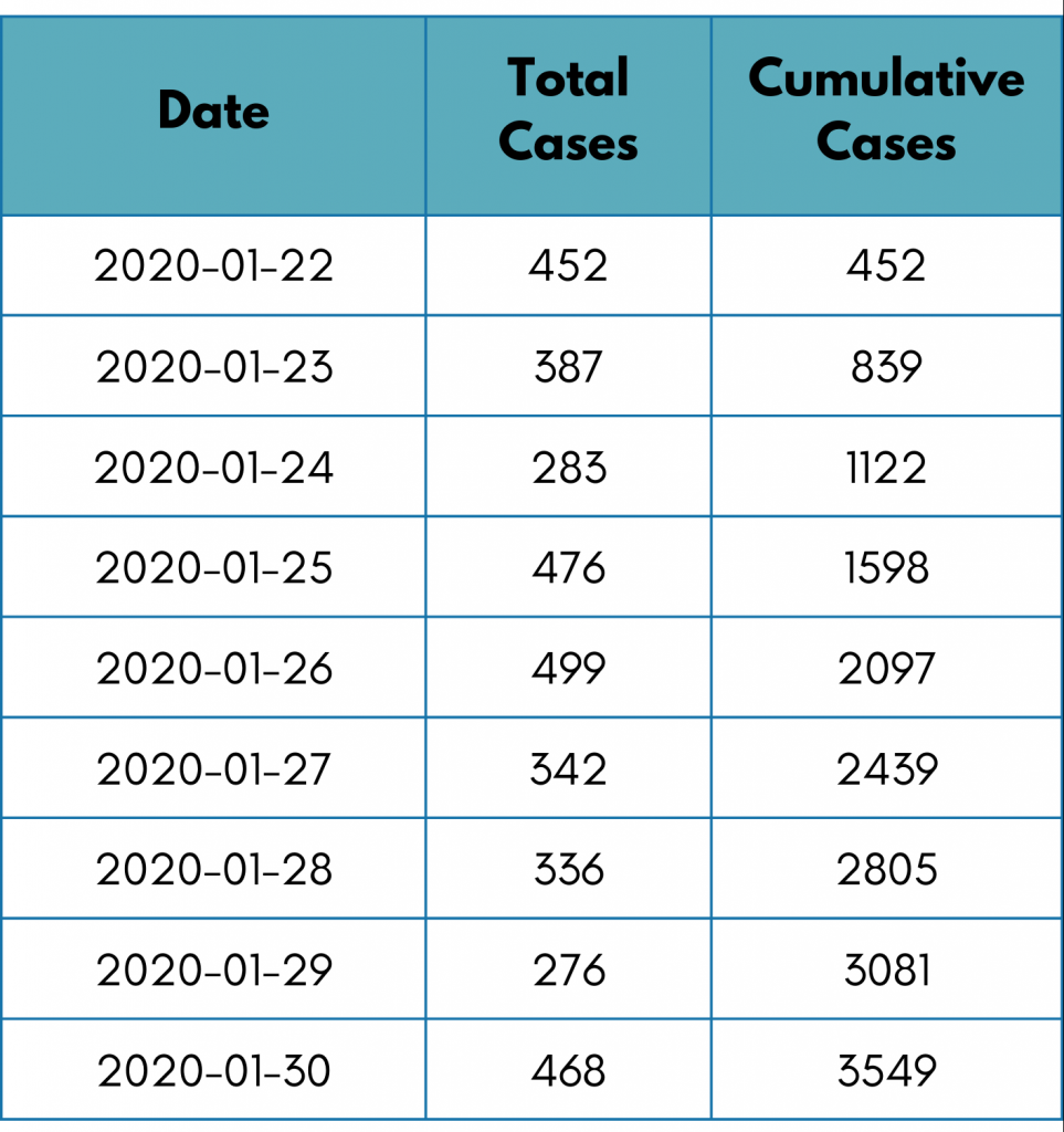
To plot this, we use a line chart. This will help us know the trends and the total number of deaths.
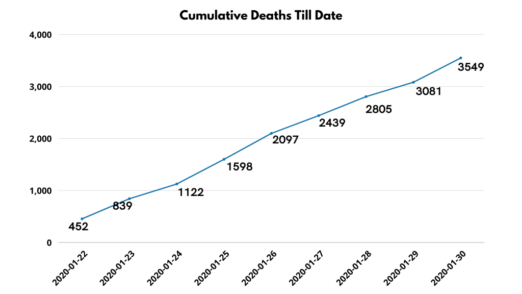
We see a positive trend here since the number of deaths has grown daily.
The cumulative frequency distributions represent aggregated frequencies. The current cumulated frequency will be the total sum of all previous frequencies.
Note: The word cumulative means ‘progressive’ or ‘growing.’
Let’s Wrap it Up!
This marks the end of our frequency distributions. In this blog, we learned about different types of frequency distributions. The frequency distributions help to do basic descriptive statistics.
It must be noted that each type has its significance and usage. Various frequency distribution techniques can be applied based on the analysis’s nature and data type. In most cases, we used a line chart, bar chart, histogram, or pie chart.