Measures of Central Tendency

Now that you know how to visualize raw data with the help of frequency distribution tables, it is time to solve another problem! For easy understanding, we will take the same COVID-19 data set we considered while learning frequency distributions.
Let’s first understand this brand-new concept of central tendency. Imagine you decided to go on a walk every day. You covered 3 kilometers on the first day, 2.5 on the second, and so on. Your friend asked you how much distance you typically cover. What would you answer?
You’d say 2 kilometers on average! Well, you answered with just one number, isn’t it?
This is what a measure of central tendency is. It helps you conclude the whole situation with a single value. This value is a number that is aggregated around a bunch of values.
In other words, the measure of central tendency represents a summary measure describing an entire data set with a single value.
There are three sure-shot metrics to measure central tendency. These are:
- Mean
- Median, and
- Mode
You will learn about them one by one. Let’s begin.
Mean
We have thousands of records of COVID-19 data consisting of COVID-19 cases and deaths. Let’s put this data into use.
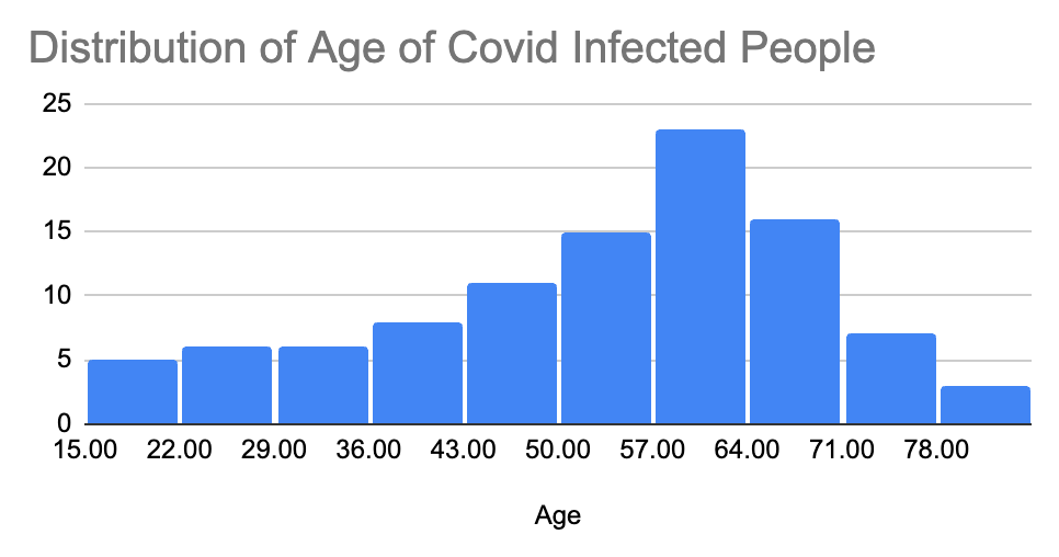
A big pharma company wants to roll out vaccines against coronavirus infections. They need to know which age group is at the highest risk of infection. Let’s try to answer this question by looking at the following frequency distribution.

By looking at this frequency distribution, we can say that the age group 36-42 has the highest risk of infection. You answer it correctly! However, there can be millions of people in the age group of 36-42, right?
But the same answer can be found by taking an average of the dataset. From our given data set of the age distribution for the number of daily COVID-19 cases, the average age is 39.37. This number is the mean age. This is where we have to measure the central tendency using the mean.
The distribution is relatively uniform here. In other words, we call it a normal distribution. But this is not very true every time. The graphs can be “skewed” or “distorted” either to the left or right.
Let’s examine the cases of positively skewed and negatively skewed distributions.
Positive Skewness/ Right-Skewed Distribution:
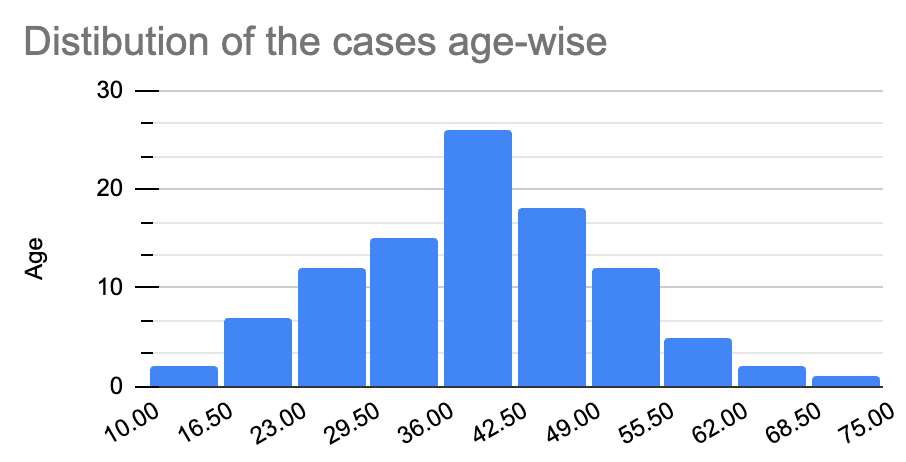
Let’s see what happens to mean in cases when the data distribution is not uniform. To understand this better, let’s go back to our COVID-19 example. The pharma company wants to analyze the cases’ age distribution to better understand the most targeted age group.
Let’s visualize it through a histogram first.
You can see that our mean has shifted to the left side from the center. The value of the mean now is 49.38.
Negative Skewness/ Left-Skewed Distribution:
Let’s consider another case of COVID-19 cases to visualize the opposite of positive skewness. It is the negative skewness or a left-skewed distribution. This type of distribution is often seen when the data distribution is asymmetric (as in the case of positive skewness).
To visualize it, let’s consider an example of the age distribution of COVID-19-infected people.
You can see how the distribution is shifted to the right in this distribution. This means that the mean is also shifted to the right. The value of the mean now is 52.76. This is a classic case of negatively-skewed frequency distribution.
So, we can say that the mean gets shifted in the direction of the presence of skewness. If the distribution is shifted to the left, so does the mean, and vice versa.
What Happens if There are Any Outliers?
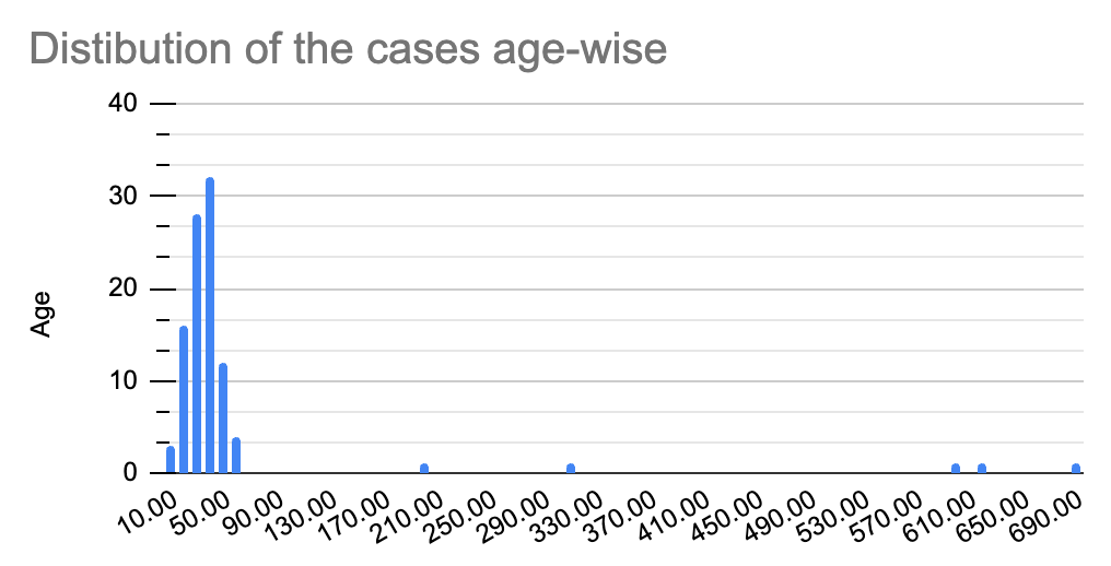
Suppose the same Pharma company we discussed before wants to roll out vaccines for second doses. For this, it wants to know which age group is affected the most.
To answer this, let’s go back to our data. But this time, you notice something unusual in the data. You see unusual values in the ‘age’ column, such as 200, 620, 310, etc.
Well, this is a real scenario. When dealing with thousands of data entries in a dataset, we often deal with missing or unusual numbers because of human errors. In this case, let’s see if the mean is the right metric.
To find out, we need to visualize the data first.

Do you notice something unusual? Yes, all the data has shifted to the left (right-skewed) with some chunks scattered across the x-axis.
The mean, in this case, turns out to be 61.17! What caused this dramatic shift in the mean? You can blame it on those unusual values referred to as outliers. No wonder, considering mean would be disastrous in such as case!
We can conclude the following with such an observation:
- Mean is very sensitive to the presence of outlier(s) in a dataset.
- Mean is not always the right metric in case of unusual data distribution.
This means it is time to explore another metric to measure the central tendency, i.e., median!
Median
As seen before, we concluded that the mean easily gets affected by outliers. Let’s see if that’s the case with median or not!
Let’s take our example where we had outliers in our dataset to prove it. We first need to find the median for normal distribution to know whether the median shifted from its mean value.
The mean for this distribution turns out to be 39.37. The median turns out to be 40 (in the normal distribution), which is quite close to the mean.
Now, let’s consider the case of outliers.
The median here turns out to be 40.5! This is the same as that we had in the case of normal distribution. Hence, the median is not affected by outliers or skewness.
Therefore, the median is a better metric for calculating the central tendency when the distribution is skewed and/ or has outliers.
Why is the median not affected?
It is because the median is the middle-most value in a data distribution. We find the middle-most value by arranging the data in ascending order. This makes it easier to find the middle-most value as the data is organized and present in a sequence.
Note: When even numbers of data values are present in a dataset, we take two middle-most values and calculate their mean. The number that comes out is the median of that dataset.
Mode
To understand the mode, let’s take a simple example. Your father owns a shoe store, and hundreds of visitors visit your store every month. You want to cut extra expenses for him, so you want to know which shoe size is the most frequently bought.
To answer this, you need to know the number of times each shoe size was sold. In other words, you need to find the most sold shoe size. Let’s say UK 7.5 was the most sold shoe size.
The size UK 7.5 is the mode here!
Therefore, the mode is the most frequently occurring value in a given dataset. Now, let’s try to apply the concept of mode to our COVID-19 dataset.
We have already looked up the number of COVID-19-infected people according to age. But what was the number of deaths according to age? Was the virus fatal?
Let’s find out with the help of mode. Here, we will consider the COVID-19 deaths dataset according to various ages. Look at the bar graph below to find out which age was the most prone to the coronavirus.
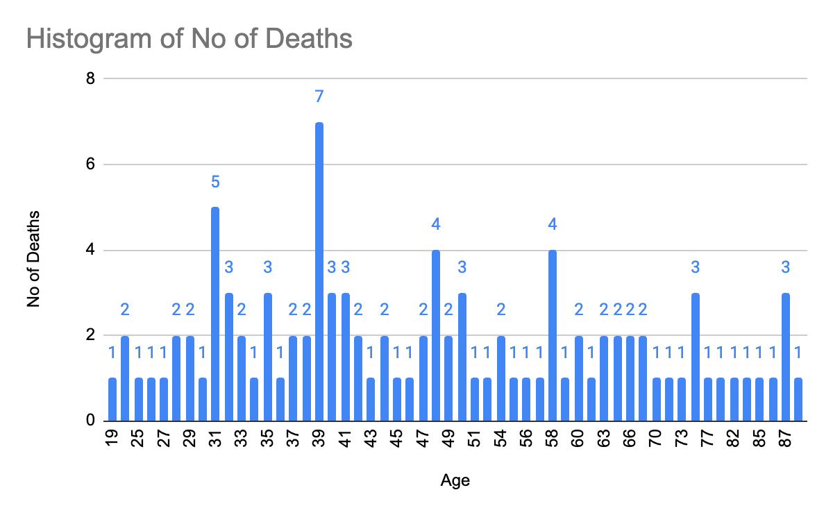
As we can see from the graph, people aged 39 have died the most.
Hence, the mode is an apt metric to determine the measure of central tendency when we want to determine the frequency of a specific occurrence.
Note: Mode can be applied to numerical and categorical data (as seen in the shoe-size example)!
What is the Best Measure of Central Tendency and Why?
We learned about the three most used methods of measuring central tendency: mean, median, and mode. However, there is no such thing as the best metric to calculate the central tendency.
The choice of the right metric depends ultimately on the use case. It entirely depends on the type of data distribution. Starting from the mean, we saw how it could not be used in skewed distributions and/or outliers. It gets easily influenced by unusual values in a data set.
As the mean is not the right metric to measure the central tendency for a dataset with outliers, we go for the median. As median is not at all affected by outliers or skewness.
Last of all, we talked about the mode. The mode has a completely different use case. It is a number or a category with the highest number of occurrences.
This is how we can draw lines between these three most popular measures of central tendency. We encourage you to practice more questions to understand their differences.
Conclusion
In this blog, we have learned how to represent data with one single value. This value that we represent is the measure of central tendency. Three metrics can measure the central tendency: mean, median, and mode.
We also learned which metric can be used in a particular use case. The use of a particular metric entirely depends on the type of data distribution. You must note that there is no such thing as the best metric.
You can apply these metrics in real-life scenarios to better understand them all!