Data Visualization — Ultimate Beginners Guide to Know Everything About Data to Design

Nowadays we are surrounded by Data, and the way people work has changed because of it. Data visualization is the graphical representation of information and data. By using visual elements like charts, graphs, and maps, data visualization tools provide an accessible way to see and understand trends, outliers, and patterns in data. Visualizing data is a valuable skill for Data Scientists and Data Analysts. It is easy to pick up but hard to master. As you develop visualizations, you need to keep in mind how the user will interact with your work. Your visualizations should be useful in helping the user analyze the data. Visualizations and tables allow the data to be more accessible to others and more understandable if done correctly.
“Data visualization is the language of decision making. Good charts effectively convey information. Great charts enable, inform, and improve decision making.” — Dante Vitagliano

History of Data Visualization
The concept of using pictures to understand data has been around for centuries, from maps and graphs in the 17th century to the invention of the pie chart in the early 1800s. Several decades later, one of the most cited examples of statistical graphics occurred when Charles Minard mapped Napoleon’s invasion of Russia. The map depicted the size of the army as well as the path of Napoleon’s retreat from Moscow — and tied that information to temperature and time scales for a more in-depth understanding of the event.

The idea of visualizing data is not new. Over a hundred years ago, scientists and thinkers found themselves drowning in their own flood of data — and to help understand it, they invented the very idea of infographics and pictorial graphs. They were manually plotted and printed on huge canvases or billboards.
With the advent of technology and computation, we can process large amounts of data at lightning-fast speeds. Today, data visualization has become a rapidly evolving blend of science and art that is certain to change the corporate landscape over the next few years.
The last three decades have seen the field of data visualization explode into dozen of focus areas. The new-age software tools enable businesses, researchers, and individuals to explore their data in new and increasingly imaginative ways and continue to refine the science and art of data visualization to bring it to new heights. Now we have the ability to chart more data, faster, and we can engage the audience with animated or interactive visualizations with the latest technologies of 3D Graphics, Virtual and Augmented Reality — there is more magic in graphs than ever before.

Data visualization is seen as the essential final step of any successful data-driven analytics strategy — Caroline Lee
Why do we need Data Visualization?
Discovering the patterns
Raw data, tables, and text captured can give you the numbers and information required, but when you represent the data in a graphical format, it becomes easier to find patterns, correlations, and hidden trends in the data.
Complex data
With the influx of huge quantities of big data from businesses with enormous volume and velocity- often in raw formats -it is essential to distill that information into comprehendible modules in order to make sense of it. Representing numbers in a visual format helps you simplify those complex structured tables into simple comprehendible information.
User interaction & experience
UX design is the prime deciding factor for the success of any product. When it comes to new age media design and web interactions, interactive data visualization techniques play a vital role in creating that enriching and seamless user experience allowing the user to interact with the data and understand the data points and the story behind it.
Content
With the web traffic reaching higher peaks than ever, users are being overloaded with information on the web. With the help of visual content, as discussed earlier — telling interesting stories through beautiful visuals such as infographics can help drive the insights to the end-user in a powerful as well as comprehensible manner. In this age of Content, Infographics and such visualization techniques play a key role in every medium.
Data Storytelling
Being a highly creative skill, data visualization can tell a story that gives significance to the data. Effective visualization can appeal to the emotions of readers, put faces to numbers, and introduce a narrative to the data.

Statistics and numbers can overwhelm a lot of audiences and therefore lose their significance. When organized in an infographic it becomes much easier to quickly draw meaning from data. The purpose of an infographic is to simplify a complex idea which makes them great educational tools, especially when presenting an overview of a topic instead of an in-depth analysis.
Applications of Data Visualizations
Business Analytics & Enterprise Reporting
Visualizations are predominantly used in the enterprise analytics and business intelligence interfaces where stakeholders get an overview of the data related to their business. Dashboards & reports are very common almost in every company across all the fields.
Digital & Virtual Presentations
Board meetings, Investor pitches, and companywide decks all contain data visualizations. Latest technological advancements have made virtual presentations with 3D visuals in VR/AR a possibility. VR simulation is another exciting area with a lot to be explored yet.
AI & Machine learning
Data visualizations are a necessity in the Data Science field. Correlation plots, accuracy graphs, loss function graphs, etc. are extremely important tools for a data scientist to make sense of the data, build and tune models, and present the end results to the stakeholders
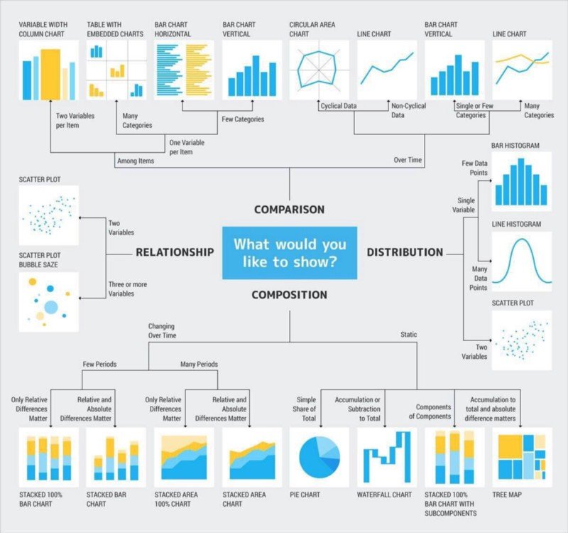
Types of Data Visualizations
Data Visualizations Tools
We have numerous tools and technologies used for data visualizations ranging from open-source software to enterprise BI solutions.
BI Tools: Tableau, PowerBI, Looker, Qlik Sense, MS Excel, etc
Visual libraries: Matplotlib, D3.js, Seaborn, etc.
Job roles in Data Visualization
There are many different types of data science problems that lead to different skill sets for each problem. Thus there are different roles in this field:
- Data Visualization Engineer
- Business Intelligence Analyst
- UI Designer
- Data Analyst
Data is playing an increasingly dominating role in the market today, and the ability to handle the data tools is the most sought-after skill the industry is looking for.
With the massive increase in volume and variety of data, data visualization has become more evolved and resourceful over the years making it a must-have skill for non-technical consumers also.
Irrespective of the role within a team/company, data visualization is a skill that’s necessary for all professionals.
If you like what we do and want to know more about our community 👥 then please consider sharing, following, and joining it. It is completely FREE.
Also, don’t forget to show your love ❤️ by clapping 👏 for this article and let us know your views 💬 in the comment.
Join here: https://blogs.colearninglounge.com/join-us